




Creating a Grouped bar graph in Prism
Step-by-Step Examples:
Creating a Bar Graph in Prism
This example shows how to make a bar graph using Prism. The method shown here must be used to graph data containing two grouping variables. A second method, the column bar graph – preferable when your data has only one grouping variable – is discussed in another step-by-step example Creating a Column Bar Graph. Once we've created and formatted our bar graph, we'll discuss some techniques for making bar graphs more understandable.
Create the Table
When you launch Prism, click Grouped on the left side panel and make sure Enter or import data into a new table is selected and 3 replicates are specified as shown below:

Click Create to exit the Welcome dialog. Prism creates and displays the new table. Click on the default table name Data 1 and rename the table GP-13062. The name that you choose is used as the title for your graph.
Enter the Data
Enter the values show below into your table. Be sure to include row and column titles.

View the Graph
As soon as you have entered your data, Prism creates a graph automatically. Click on that graph in the left panel navigator, click the Summary data tab, and choose the first graph. After the graph is created, change the Xtitle to Treatment and the Ytitle to Activity. You can change axis titles by clicking on the default axis title (the y-axis text will flip to horizontal) and typing. When done, click anywhere on the graph. Use Insert menu > Character > Insert Greek to enter Greek letters.

Prism automatically graphs all the data sets (columns A and B) on the data table. You may easily add or remove data sets from the graph (Change menu…Remove/Replace Data Sets…).
Note carefully how the information on your data table is used to create the bar graph:
- To change colors, patterns, and borders of the bars, double-click on one of the bars to open the Format Graph dialog.
- The name of the data table becomes the title of the graph.
- Error bars are produced automatically. Prism averages replicate values and plots the mean and standard deviation (or SEM, 95% CI, or Range if chosen).
Format the Graph
Refer to the illustration of the graph below as you make these format changes:
| To: | Do this: |
| Make the axes thicker | Go to Change menu and choose Frame and Origin. Select a thicker setting. |
| Change the bar appearance | Double-click on a bar to bring up the Format Graph dialog. Change fill color, fill pattern, and border thickness. |
| Change the axis numbering | Double-click on the Y axis to bring up the Axes dialog. Click on the box labeled Auto to deselect it. Then change the tick interval and add minor ticks. |
| Move the legend | Click on the "Pre-treatment" legend to select it. Hold the Shift key and click on the "Post-treatment" legend to select it also. Drag both legends on the graph to move them. |
| Frame the legend | Click the rectangle tool and draw a box around the legends. |
| Convert the error bars from SEM to SD | Double-click on a bar to bring up the Format Bars dialog. Check the All box to make a global change to all data sets on the graph, and click on SD error bars. Increase the thickness of the bars. |

Techniques for Making Bar Graphs more Understandable
Rearranging Bars
To change how the bars are arranged, such as interchanging between vertical and horizontal bars, choose Graph Type from the Change menu.
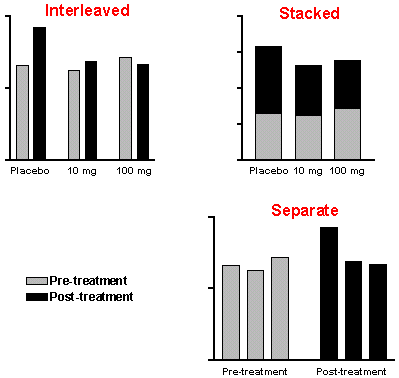
You can also modify how the bars are grouped. You can choose among interleaved, stacked, or separate bar arrangements, as shown below. If there are three or more columns, you can also choose a custom arrangement (a mixture of arrangements, not shown) by choosing Data Set Order & Arrangement from the Change menu.
Transposing Data
The way Prism draws and groups bars depends upon how data is arranged in the table. All bars from the same data set have the same color and fill pattern. If the distinction between different bar appearances and different bars of the same appearance isn't what you want, try transposing the data table. From the data table view, click Analyze, choose Transform, Normalize… Transpose X and Y, and click OK. Your original data table and graph are not modified, but the transposed table is produced on a "results" sheet and a new graph of the transposed data is created. For example, see the before and after in the two graphs below.
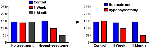
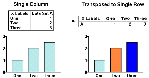
This may be useful even when your data has only one grouping variable, as in the example below. In this instance, you can use transposition to switch between having all bars shown in the same way and having bars shown differently.
Spacing: Uniform Changes
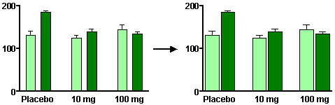
You can change the spacing of bars by double-clicking on the graph and choosing the Graph Settings tab. Here is the effect of a decrease in the gap between adjacent data (note that the bars widen in the process):
Spacing: Custom Changes
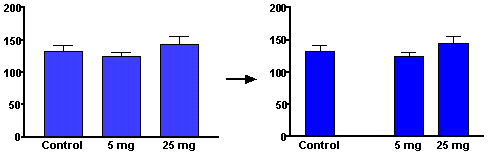
You may wish to introduce additional spacing into a bar graph to isolate one group of bars in particular – not to be confused with the spacing described above, which is placed between all groups. You can create this extra space by inserting an empty row in the data table in the appropriate place. For example, inserting the empty row (2) in the following data table…

…produces this change in the graph:
Remembering that Prism shows values in any given data set in the same way suggests another way single out one, or a few, bars to be shown differently. You can always change a bar or symbol appearance by moving data to another column (data set). Thus this table…

…leads to this graph:

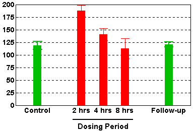
You can also enter your data into an XY data table and enter X values such as 1, 3, 4, 5, and 7 to control the spacing of the bars. The resulting default XY graph will show your values as symbols, but you can change those symbols to "spikes" (in the Change menu > Symbols & Lines dialog, choose to change All data sets at the top, uncheck Show Symbols and check Show bars/spikes/droplines). Finally, change the numbers along the X axis to text labels in the Additional ticks and grid lines section of the Format Axes dialog (choose X axis from the Change menu).
Here's the graph:
Alternatives to Bar Graphs
We've just shown an example of using an XY graph that actually looks like a bar graph to solve a bar-spacing problem. This technique is useful anytime you want to show data using bars, but you want to position the bars horizontally according to the value of an X coordinate rather that spacing them evenly. It's also useful for graphs that contain both bars and lines. Here are some examples:
- Combining bars and lines on the same graph is demonstrated in another step-by-step example, Combining a Bar Graph with a Line Graph.
- Creating a histogram, particularly when you wish to superimpose a line showing an ideal frequency distribution.
- Creating a mass spectograph, where symbols on the XY plot are replaced by "spikes".
Finally, another option, the column bar graph – recommended when your data has only one grouping variables illustrated in Creating a Column Bar Graph.