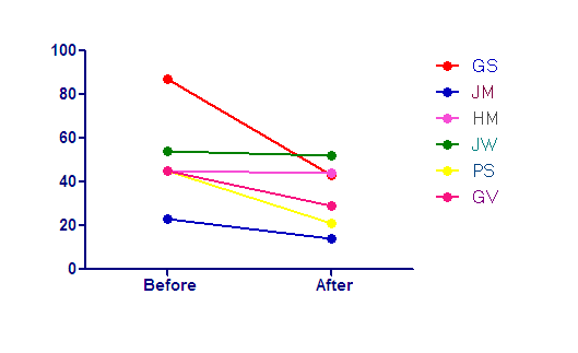
Graph tip - How to Individually color each line (and pair of points) on a before-after graph.

This example shows two ways to make a before/after graph, and how to change the colors of the lines connecting individual pairs of data.
How to do it:
Normally with a before after graph you start with a Column data table and enter the values into side-by-side before and after columns.

This creates a nice before/after graph with connecting lines, but you can't format the connecting lines to identify individuals.

If you want to match the colors between pairs of data, start instead with a Grouped data table. Start with the thumbnail for a Category graph and tell Prism that you want to enter and plot a single Y value for each point.

On the data table, enter Before and After as row titles, and enter your before after values on the first two rows as shown. If you've already made the data table and graph as above, you can copy your data from the data table and paste it into the new one using Paste Transpose.

This will also create a before/after graph.

With this graph, double-click on any data point to open the Format Graph dialog. Since each pair of points is a separate data set, you can color them individually. If you only want to color some differently, first click the All button and select a color for all of the data sets. Then use the arrows at the top of the dialog next to the Data set name to move from one data set to the next and color the ones you want to be different. You can also change the size or shape of the symbols for each pair, or series, of data points to customize them further.

Here is the finished graph.

Download this file if you would like to see how this graph was made.


