
How can I make a Before/After graph?
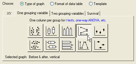
Creating the plot using Prism 4 is easy. When you select the graph type, choose the "One grouping variable" tab, then click the thumbnail for either the vertical or the horizontal "Before & after" graph.
Place the "before" and "after" values in adjacent columns of the resulting data table.
With Prism 3, you'll need to use a work-around. Suppose you'd like to make this graph:
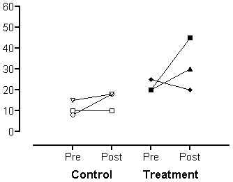
This can be done fairly easily in Prism if your data sets aren't too large. The trick is to enter each pair of observations as a separate data set. Study this example table:
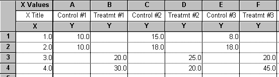
The X values are arbitrary and serve to place the points horizontally where you want them. In this case, they are the repeating sequence from 1 to 2n, where n = number of treatment groups.
If you have very many individuals, Prism will re-use symbols. You'll probably want to edit the symbol patterms.
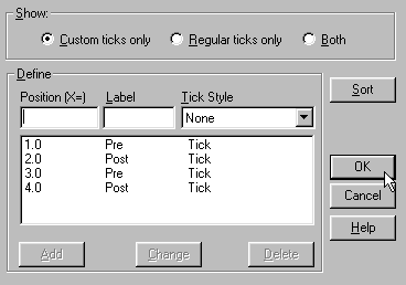
Finally, you probably won't want the X axis tick labels, so replace them with something more meaningful using Custom Ticks. To create custom ticks, double-click on an axis to bring up the Format Axis dialog, and then click the button "Custom Ticks". Here are the Custom Tick settings used to produce our example graph:
Keywords: before-after before-and-after before after