
KNOWLEDGEBASE - ARTICLE #1280
My X axis is time. How can I create a horizontal stripe or bar that marks certain time range (when a treatment was applied)?
Prism can do what you want with a bit of hassle. Follow these steps, which work only in Prism 5.
Simple approach (fewer choices for thickness)
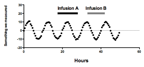
This Prism file makes the graph above using the first approach.
Here is the Prism file that made the graph above using the second (fancy) approach.
Simple approach (fewer choices for thickness)
- Create a new XY data table formatted for entry of mean single Y value (no subcolumn)
- Create a bogus data set on that table to mark your time line. It will have only two points. The X values mark the X range you want to mark. Both Y values should be the same, and control the height of the time line in the units of your Y axis.
- Delete the graph that Prism made of your new data table, as it won't be helpful.
- Go to the graph of your actual data, to which you want to add a time line bar.
- Drag the new table and drop onto the graph.
- Double click on the graph to bring up Format Graph dialog.
- Use the drop down to go to the new data set you dragged onto the graph.
- Uncheck plotting of symbols.
- Check to plot a connecting line, and make it thick (the maximum is 6 pt).
- Look at your graph. It should look like what you want. You may need to go back and adjust the values of Y or the thickness of the connecting line to get the look you want. If you want the line thicker than 6 pt, read on for an alternative approach.
- Create a new XY data table formatted for entry of mean and SD.
- Create a bogus data set on that table to mark your time line. It will have only two points. The X values mark the X range you want to mark. Both Y values should be the same, and control the height of the time line in the units of your Y axis. Enter the same value as SD for both data points. This controls how fat the time line bar will be.
- Delete the graph that Prism made of your new data table, as it won't be helpful.
- Go to the graph of your actual data, to which you want to add a time line bar.
- Drag the new table and drop onto the graph.
- Double click on the graph to bring up Format Graph dialog.
- Use the drop down to go to the new data set you dragged onto the graph.
- Uncheck plotting of symbols.
- Uncheck also the connecting line
- Check the option to plot error bars, plot the "----" style in half-point thickness.
- At the bottom of the dialog, choose area fill and choose to fill within the error bands. Choose no fill and a color that matches the error bar color.
- Look at your graph. It should look like what you want. You may need to go back and adjust the values of Y or the SD of your fake data set to get the time bar where you want it.

This Prism file makes the graph above using the first approach.
Here is the Prism file that made the graph above using the second (fancy) approach.
Keywords: Drug markers, time markers, time bars, treatment markers