
KNOWLEDGEBASE - ARTICLE #1981
How to make a before-after-before-after graph with Prism
Individual before-after lines
There are two ways to make this graph with Prism.

Method 1. Use different rows for the two sets of data
Enter the data like this, and choose a before-after graph and you'll be done.

Method 2. Use the same rows for the two sets of data
Enter the data like this, and make a before-after graph.

This format is more compact and lets you use the same row titles for both sets of data, which might make sense in some cases. But Prism will connect all the points in a row. So the first "Treated" data will be connected to the second "Control" data. To change that, double click on the first Treated data set. On the Format Graph dialog, change the appearance from before-after to aligned scatter plot. Those symbols will still connect the the data set in front of them (A) but not to the next data set (C), so you'll get the graph shown at the top of the page.

Connecting mean with error bars
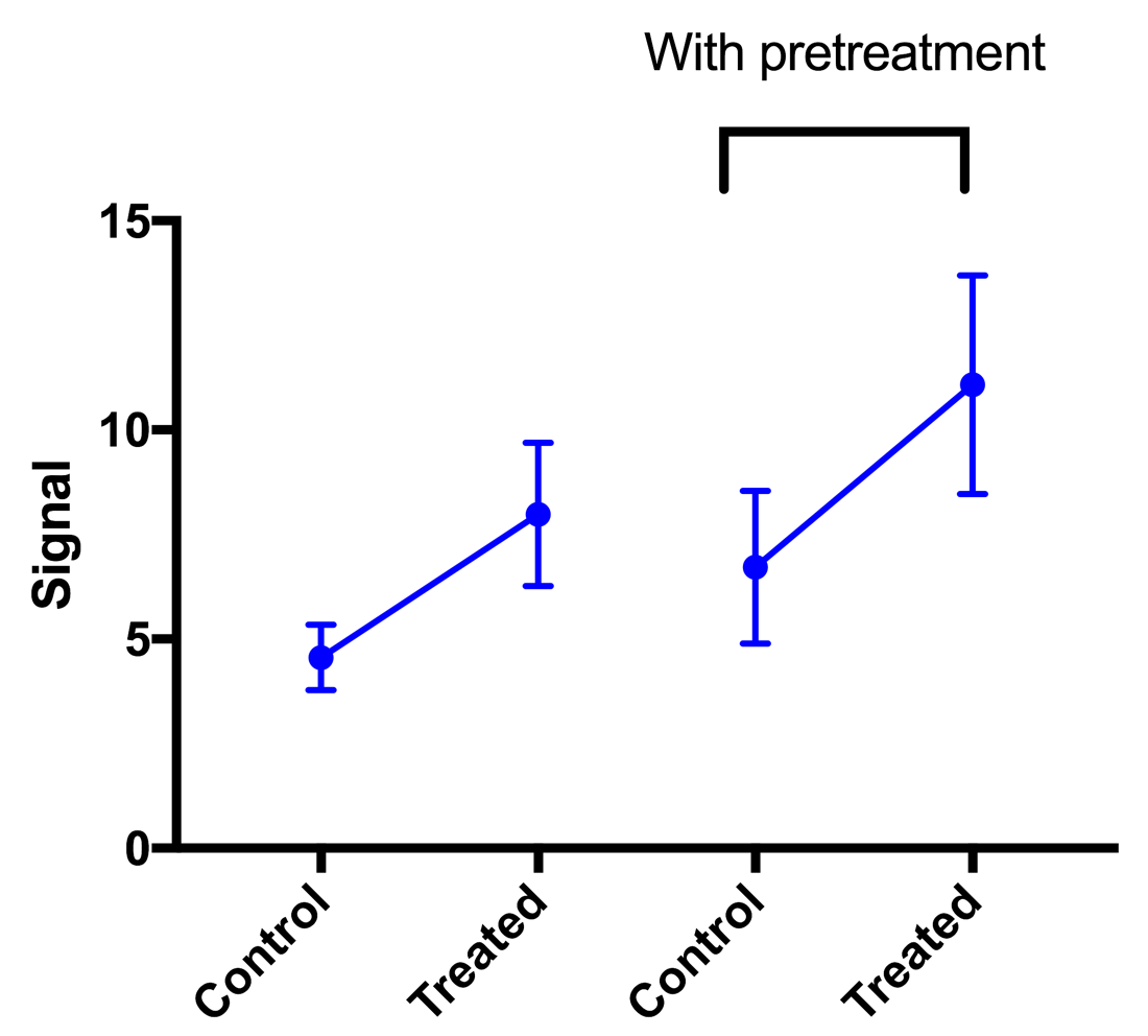
- Enter the data as shown under method 2 above (method 1 would work too).
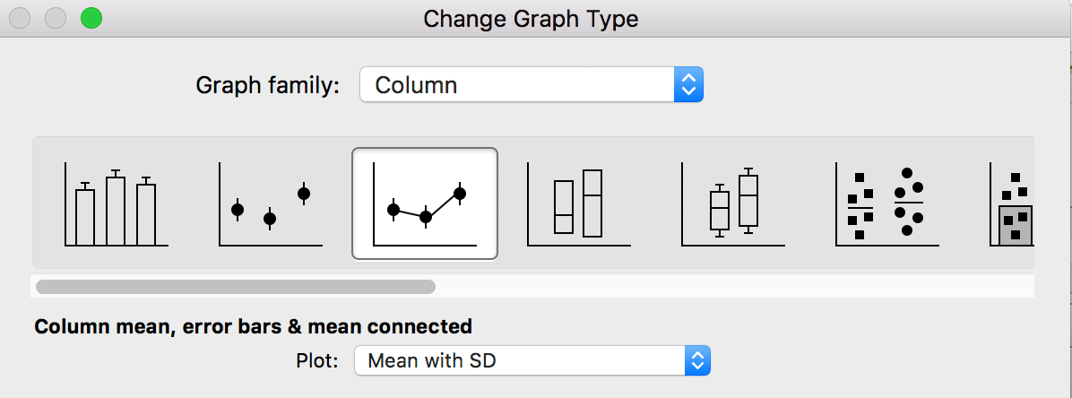
- Make a Column graph of column means, with error bars and means connected.
- Now the graph will include a line connecting all four means.
- Double click on the second data set to bring up Format Graph. Uncheck the option to draw "Lines".


Keywords: before after before after