How to create a Grouped before-after graph that also includes bars showing the mean
How to make this graph:
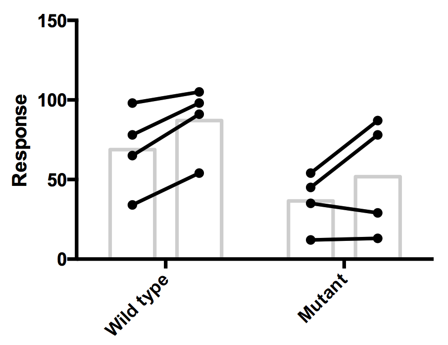
- Enter data on a grouped table. Enter the before-after values on the same row, in the corresponding subcolumn. For example, the value in the Y2 subcolumn of the Before column for the Mutant row (35) is matched to the Y2 subcolumn of the After dataset of that row (29).
.png)
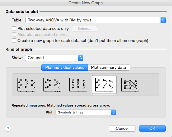
- From the New graph dialog choose a Grouped repeated measures graph.

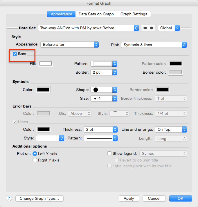
- You'll see the repeated measures graph without the bars. Double click on the graph to bring up Format Graph and then check the option to show bars. Also adjust the symbol size, shape and colors as needed.

- This adds bars showing the means. It is not possible to add error bars.


.png)
