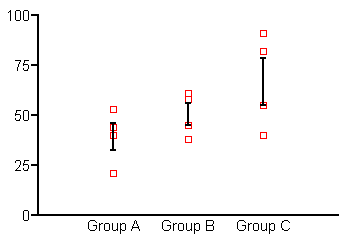
How can I put error bars on a column scatter graph? I want both individual points and error bars.
For earlier versions, you'll need to use a work-around. The graph below is a pseudo-column scatter graph--actually an X-Y plot.

Enter each group of Y replicates twice, once as data set A, then again as data set B. Continue entering subsequent data groups in the same way, one beneath the other, as shown below. Enter X = 1 for the first group (here, Group A), X = 2 for the next group (Group B), etc.

The default graph will have each data set plotted twice, one on top of the other. Using the "Symbols and Lines" dialog, format Data Set A to be plotted as error bars only--plot "mean of replicates", assign a symbol size of 0, and set up the error bars you want. Format Data Set B to be plotted as symbols only--plot "each replicate", and omit error bars.
Finally, you're not likely to find the X-axis tick labels of "1, 2, etc." very useful, so use the Custom Ticks feature to substitute the labels you want.


