Graph tip - How to show mean and/or error information on a before-after graph.

This example explains how to show error information on a before-after graph, how to format individual columns on scatter and column graphs, and how to adjust column spacing. Click here to see how to make two graphs and overlay them on a layout.
How to do it:
Prism's before and after graphs don't have the option of having error bars.

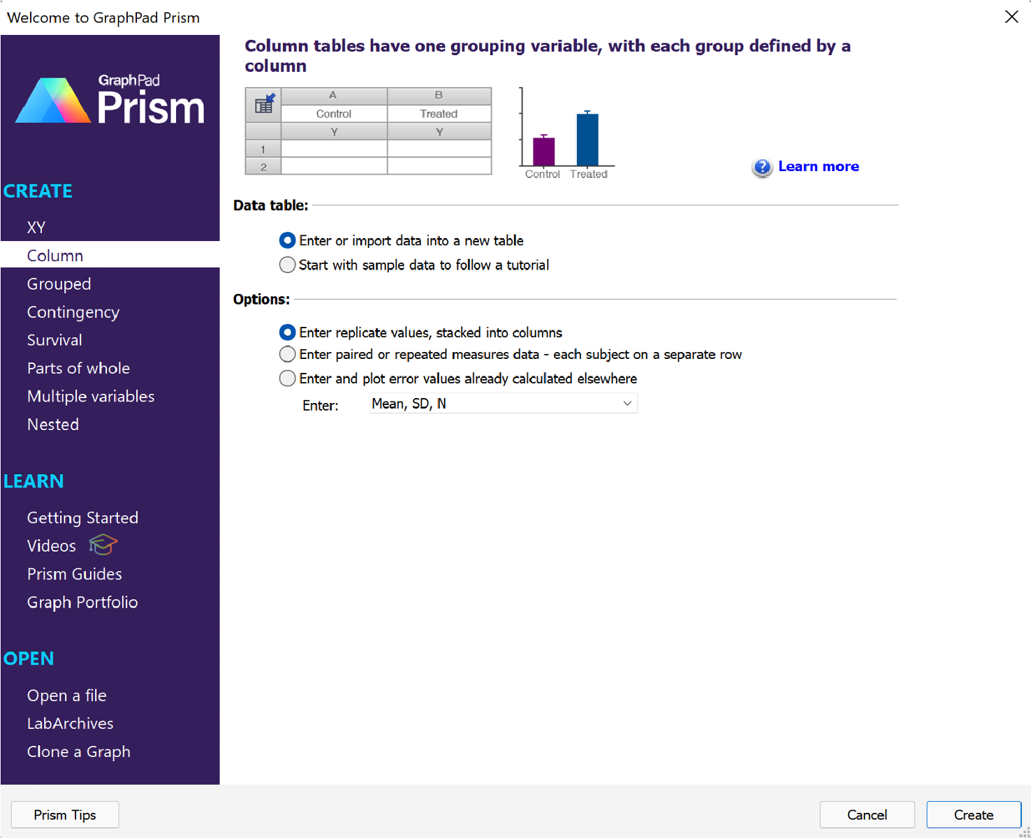
But there is a way to show mean and error values on the same graph as before and after data. Start a new Column data table.

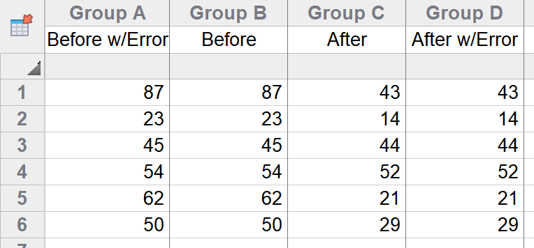
In the newly created data table, enter the "Before" data into Column A, and then enter it again in Column B. Enter the "After" data in Column C, and then enter it again in Column D. To make it easier to read, you can use the following labels:
- Column A: "Before w/Error"
- Column B: "Before"
- Column C: "After"
- Column D: "After w/Error"
When you're done, the data table should look something like this:

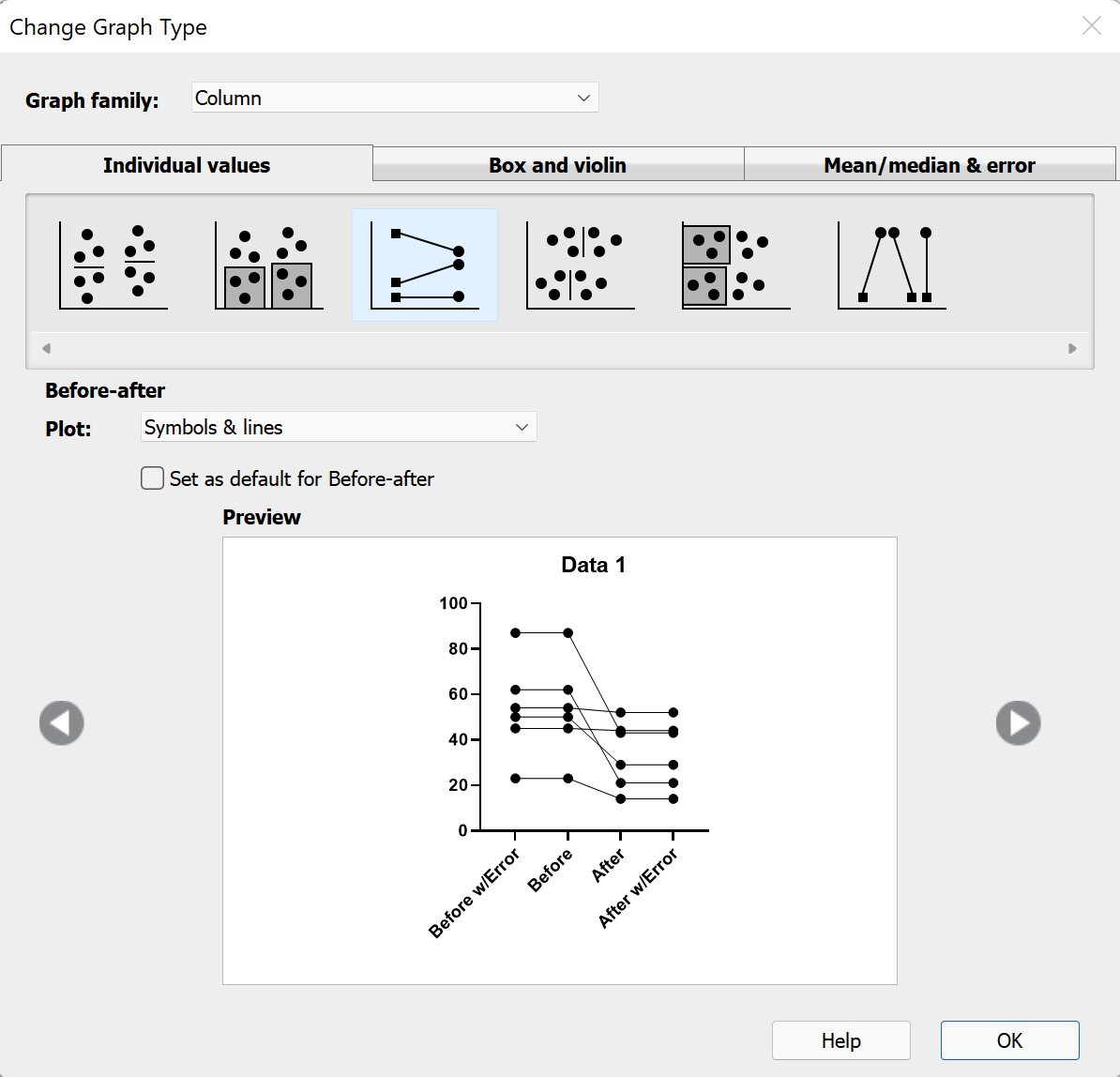
Now that the data have been entered in this duplicate way, switch to the graph sheet. The "Change Graph Type" dialog will appear. On this dialog, select the "Individual values" tab of graph types, and then choose the "Before-after" type of graph.

After clicking "OK", the resulting graph won't be exactly what we're looking for, but we'll fix this in the next few steps.

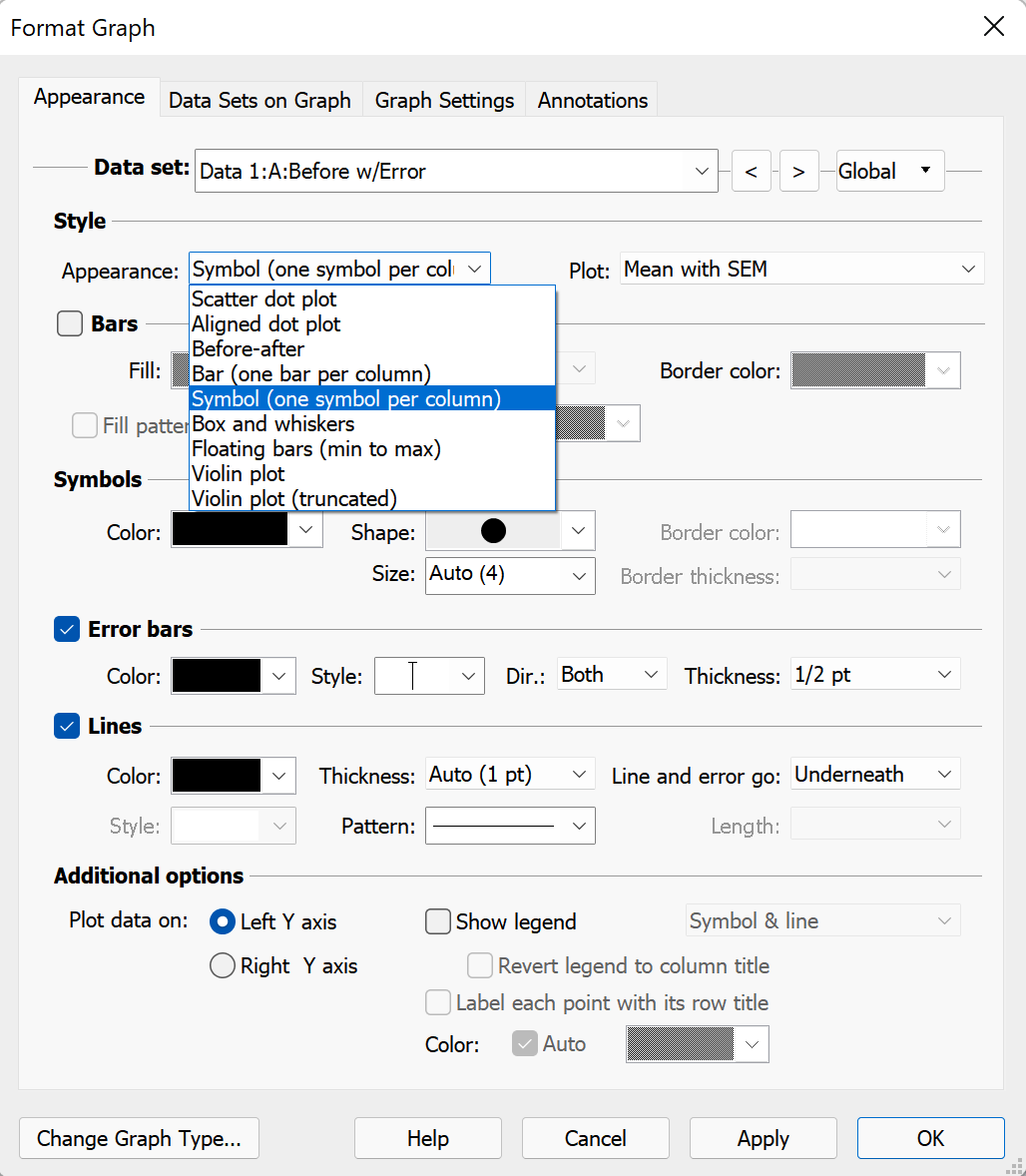
The key to creating the graph that we want is understanding that each data set (or column) on a Column graph within Prism can be formatted independently of the others. Open the Format Graph dialog by double clicking anywhere in the graphing area (or using the button in the toolbar). On the "Appearance" tab, be sure that the first data set ("Before w/Error") is selected in the "Data set:" dropdown menu. Then, use the "Appearance" dropdown menu on the Appearance tab to choose Symbol - one per column. Finally, use the "Plot" dropdown menu on the right to select how you would like to display the symbol and error (for example, "Mean with SEM" to plot the symbol at the mean value of the column and the error bars to indicate the standard error of the mean).

Once you have the "Before w/Error" data set customized the way you want it, you can use the "Data set:" dropdown menu (or the right/left arrows) to select "After w/Error" data set, and make the same changes to this data set as you did for "Before w/Error". Make sure that you leave the "Appearance" dropdown menu for data sets B and C ("Before" and "After") as "Before-after" so that the connecting lines will connect the data points between these two data sets.

Download this file if you would like to see how this graph was made.
Keywords: before-and-after error bars SD SEM


