Graph tip - How to make a grouped box and whiskers plot.
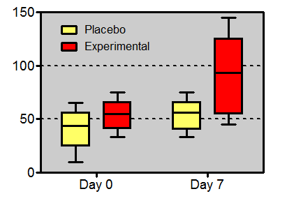
This example shows two ways to make a box and whiskers plot, with column data or with grouped data. It also shows how to paste/transpose data from a column of values to fill a row.
How to do it:
With Prism it is easy to make a box and whiskers graph.
Column graphs - one grouping variable
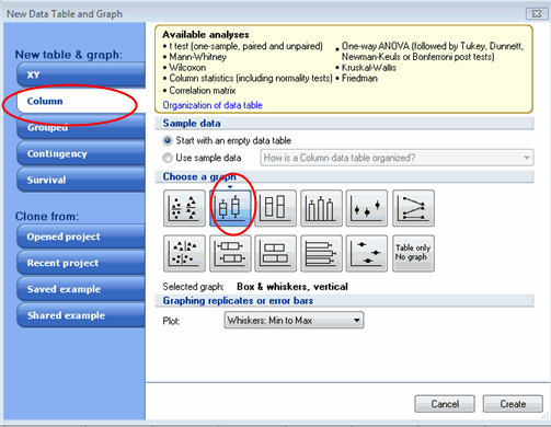
Start with a Column graph data table and choose the thumbnail for a box-and whiskers graph.
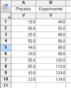
Enter all the replicates for each data set in a separate column.
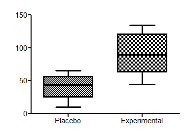
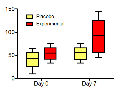
Here is your graph:
Grouped graphs - two grouping variables
Prism can also create grouped box-and-whisker graphs, but it takes an extra step:
Start by making a grouped data table and an interleaved bar graph.
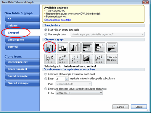
Enter your data as below with side-by-side replicates.

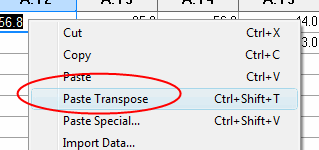
If you already have your data in a data table for a column graph, you can right-mouse click and choose Paste Transpose to convert from a column to a row of values.
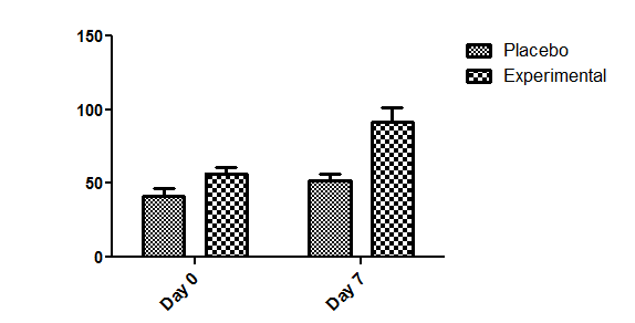
This will create an interleaved bar graph.
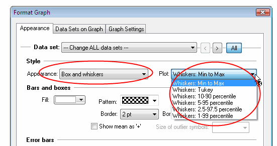
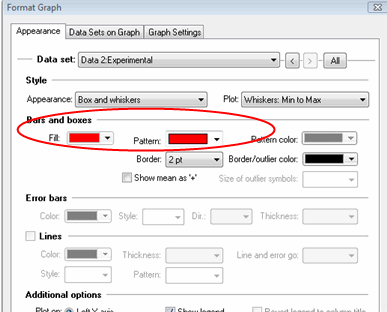
Then double-click on any graph to open the Format Graph dialog. Click the All button to select all data sets, and change the format to Box and Whiskers and choose what you want the whiskers to represent.
You can also adjust the colors and fill patterns as you like.
If you want to change how the axes look, double-click on either axis to open the Format Axis dialog. Go to the Frame and Origin tab.
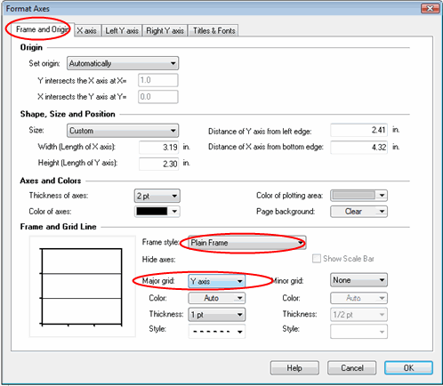
You can change the Frame style to show offset axes, or to put a frame around the graph. In the same section you can choose to show grids on your graph.

Download this file to see how this graph was made.


