Graph tip - How can I make a histogram starting with raw data? I want Prism to compute the frequency distribution for me.
Frequency Distribution Histogram
How to do it with Prism
For the latest guide on how to create a frequency distribution histogram in Prism, visit the user guide on creating a Prism histogram.
Older versions
Prism 7: This page in the Prism 7 guide helps explains.
Prism 5: See this step by step explanation in the Prism 5 Help system.
Prism 4: Consult the section entitled "Histograms from Raw Data, using Automatic Frequency Computation" in this learning example.
Prism 3: Set up a table formatted as follows: X column = None (column graph), Y columns = A single column of values. Enter your raw data in the first column (only part of the table for this example is shown below):

Click "Analyze" and choose "Statistical Analyses.. Frequency distribution (histogram)". In the Parameters dialog, check the box to "Create a new graph of the results". Note that you can manually set bin widths in this dialog, or you can allow Prism to do that for you. When the analysis is complete, a Results sheet appears showing values Prism has computed for the frequency distribution:

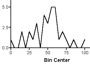
Click on the newly generated graph sheet to view a line graph of that distribution:

The quickest way to convert to a bar histogram is to click "Change.. Graph Type", then choose "Graph Type: Bar Chart". In the illustration below, we reduced the horizontal axis label font size to accommodate the numerous bin center labels:

Some users like to superimpose a line showing a fitted Gaussian distribution. To do that, rather than changing the graph type, leave it as an X-Y plot. Click "Change.. Symbols and Lines". Remove the connecting line, click the "Symbols" check box, and change the symbol shape to one of the last four choices. This produces "spikes" or bars in place of point symbols. Increase the symbol size, which will widen the "bars", if desired. Here are the selections:

Note that this pseudo-bar graph approach (still an X-Y plot as far as Prism is concerned) results in easier-to-read bin center labeling, so you may want to use it even if you're not interested in superimposing a line on the graph. An additional advantage is that you can edit the X-axis range and tick intervals to improve the appearance and readability of the graph:

Now generate the fitted distribution line--start by clicking "Analyze.. Curves & Regression.. Nonlinear regression (curve fit)". In the "Parameters: Nonlinear regression" dialog, choose "Gaussian distribution" from the list of classic equations.


