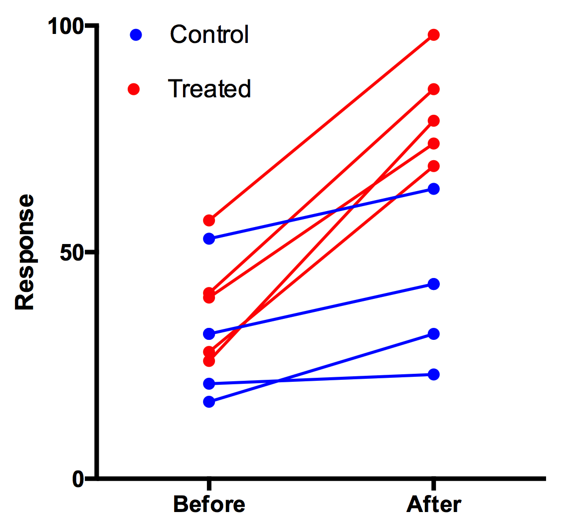
Creating a color coded before-after graph
Two (or a few colors)

You have to use a few tricks to make this graph with Prism. Before after column graphs are made so all the points and lines have the same color. You can select a range of rows and choose to change color for associated symbols, but that won't change the lines.
To make this graph, enter the data on a grouped table. The before after pairs are stacked into subcolumns, so there are only two rows of data. Each data set column becomes a different color. Here is the data table:

Even though the data table is Grouped, the graph is XY. Choose to draw connecting lines, one line per subcolumn.

One color per before-after pair
1. Enter the data as usual for a before-after graph. Use a column table, and enter the Before data in Column A and the After in Column B.
2. Use the Transpose analysis (near the top of the list of analyses) with these settings.

Now every before-after pair will be in its own data set column, with before data in row 1 and after data in row 2.
3. Use New...Graph of existing data using these settings.

4. If needed, apply the Colors color scheme. Every pair will have it own color. Double click on the graph to change.
Related:
How to make a before-after-before-after graph
How to make a grouped before-after graph


