
Color differences in Mac Prism interface vs graphs exported or pasted into other applications due to data density
The problem
There is a known issue with Mac Prism that occurs when copying or exporting a Prism graph with a high density of closely positioned data objects (such as cells of a heatmap or slices of a parts of whole graph). This issue results in the colors appearing different in the Prism interface and the program that the copied graph was pasted into or the exported graph was opened with.
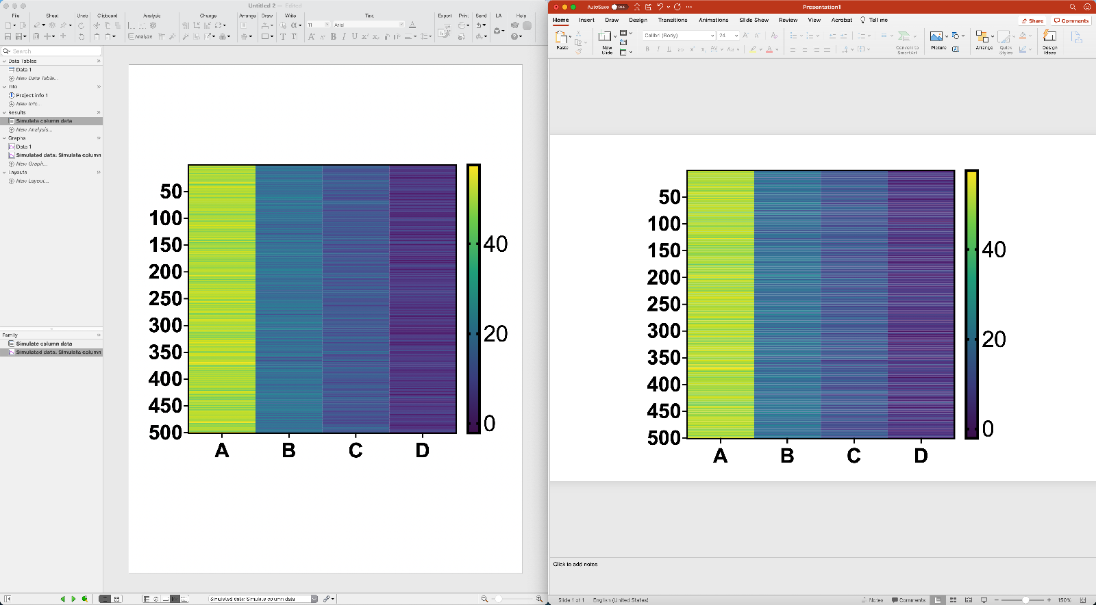
Here is an example of the issue demonstrated with a heatmap using Prism and PowerPoint:
The differences in color between these two graphs is most notable for the darker colors (columns C and D). In PowerPoint, the colors appear "faded" or "washed out" when compared to their appearance in the Prism interface.
Here is another example of the issue, this time using a parts of whole graph

Potential solution
The reason this issue occurs is the high density of different colored data objects (such as cells of a heatmap) in a small area. Decreasing this density will result in Prism rendering the graph differently (see the explanation of the problem below). For example, the size of the graph could be increased to fit the full canvas prior to exporting or copying/pasting the graph to a different application. This will make the difference between how the graph is presented in Prism and how it is presented in any other application less visible or not visible at all. Increasing the size of the graph will result in Prism updating how the graph is rendered, and will make the exported/copied graph's representation in other applications more uniform with its appearance in Prism.
Here's the example of color differences of a graph in Prism and PowerPoint used earlier shown before resizing:

The color differences are most visible in the darker regions of the graph (columns C and D).
And the same comparison after resizing the graph:
The color differences between these two graphs should be much less noticeable now
Resizing after exporting/copying
Note that if you choose to resize a graph using a third-party application after it has been exported or copied from Prism, the resulting colors may still look different
The core of the issue
Color mismatch happens when several objects are plotted in the same pixel and rendered on the screen. In the heatmap example above, the cells are plotted in a way such that several cells occupy a single pixel, while each of the individual cells has a different fill color. In Prism, the way heatmaps are drawn on the screen is slightly different than the way that the graph is exported to a picture. This difference is intended to ensure that colors do not appear "washed out" on the screen.
It is up to other apps to determine how to render a PDF image copied or exported from Prism. And - as demonstrated - they may render images differently than Prism does.
Similar behaviors can be observed in other applications with regards to how graphs/images are rendered when those graphs contain a high density of colored elements. For example, graphs with a large number of stacked bars created in excel will look different when viewed in Preview (look for the "wave" pattern in the right-hand side of the graphs below)

Similar issues can be observed with graphs generated by Google Sheets:

Keywords: mac color discrepancy copy paste export graph