Label bar graphs
Bar graphs can include the mean, median or sample size on top, or within, the bars.
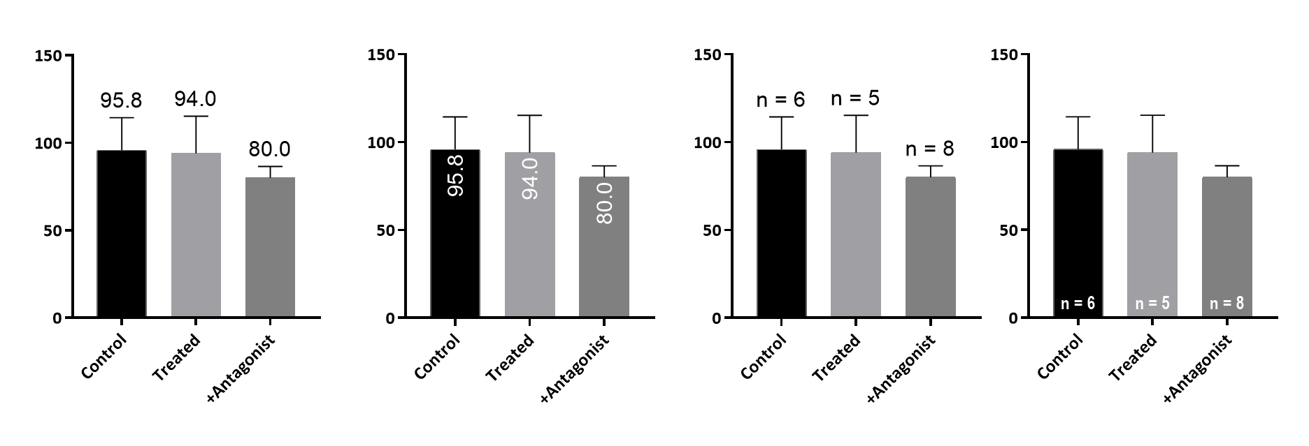
Place bar labels within the bars rather than under the bars.
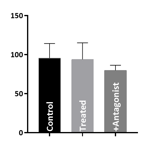
You can choose the color for the text, or choose auto choice so the text is either black or white depending on the background (added in Prism 8.1).
It is now easier to create Grouped graphs that combine bar graphs with also plotting each point as a symbol.
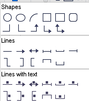
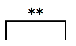
Draw lines and brackets with centered text (with an easy way to write asterisks)
Scatter plots with - or without - "smiles"
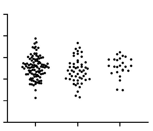
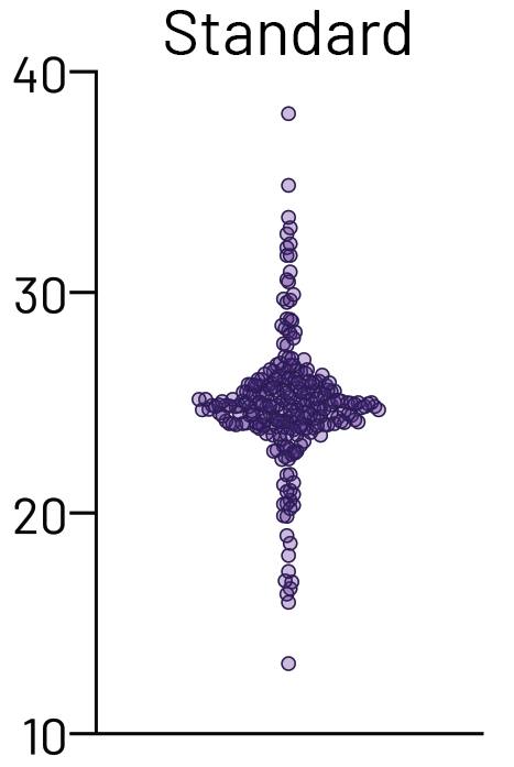
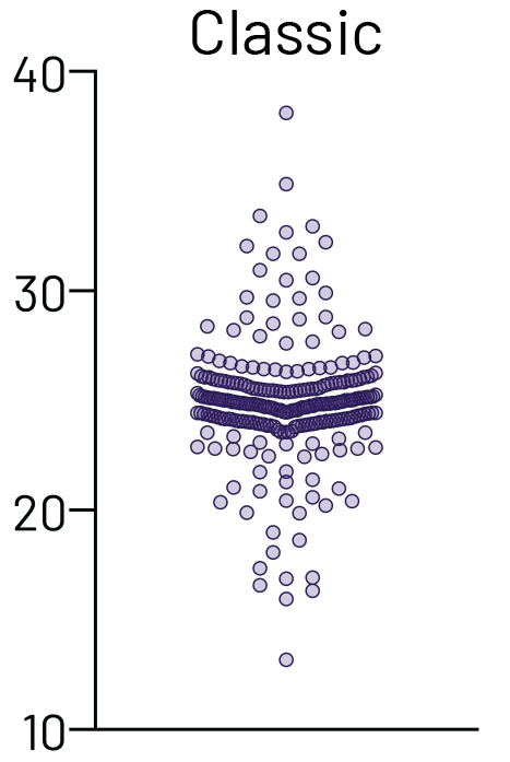
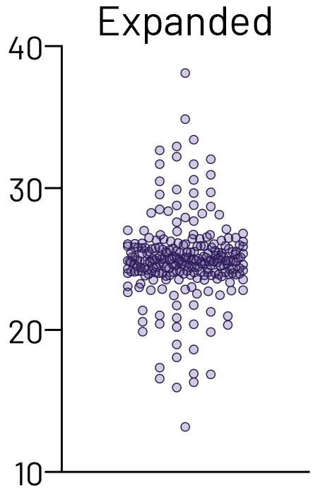
Scatter graphs plot every value, moving points left or right to avoid overlap. Prism 7 sometimes ended up arranging the points in a way that created "smiles" as shown in the graph on the left below. Prism 8 (right graph below) is much smarter about this, so the default graphs look better, and do a much better job showing the distribution of the data.
|
|
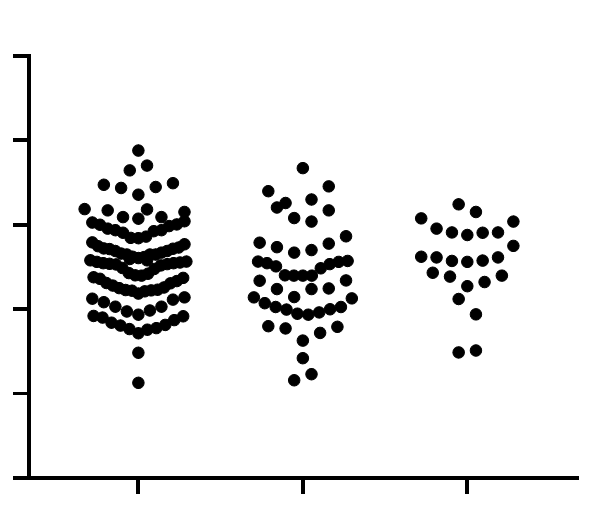
However, we've listened to your feedback, and in Prism 8.2 we introduced the ability to select from three different scatter plot styles:

The three graphs below show the same data, plotted using each of the three options above:
Improved importing or pasting of images
•Crop an image that has been imported or pasted onto a graph or layout.
•Resize an imported image without accidentally distorting it. Check an option to allow distortion if you really want to change the aspect ratio.
•Import pdf and eps images onto a graph or layout (new for Prism Windows; Prism Mac could already do this)..
Adjust color of any block of values
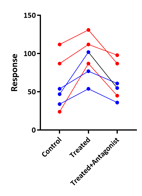
•Color code spaghetti graphs. Select a subcolumn of data, right click and choose a different color for those points or lines.
•Color code before-after graphs. Select range of rows in a column table, or subcolumns in a Grouped table, right click and choose a different color for those before-after points and lines. Prism 7 could do this in some cases, and Prism 8 extends this to all graphs.
Axis numbering
•Powers-of-ten numbering on axis no longer adds silly leading zeroes. The label for when X or Y equals 5 is now 105 not 1005.
•In preferences, choose an ordinary minus sign or a longer en-dash to show negative numbers on axis numbering.
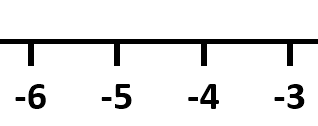
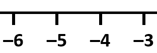
•For axis numbering, the decimal point can be middot, also known as interpunkt. The decimal point is aligned with the middle of the digits, not their bottom. Some journals request this.

Other improvements
•Better default graphs, with more choices made automatically.
•New command to reverse the order of data sets in the legend.
•You can now add up to 100 additional ticks, grid lines and labels to an axis (Prism 7 allowed only 30).
•New choice on XY graphs to include a line of identity (used automatically for QQ plots and ROC curves)
•Choose fill patterns on parts-of-whole graphs.
•Change which data set is plotted in a parts-of-whole graph.
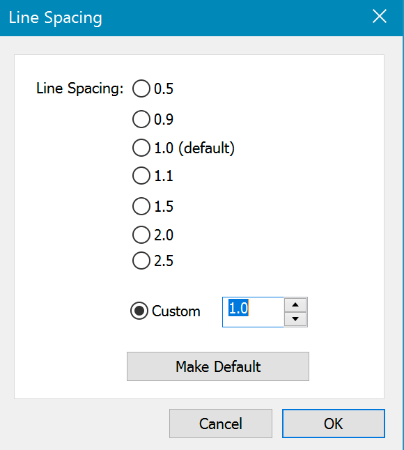
•Choose line spacing for text objects.
•New color schemes, including a "Colorblind Safe" color scheme, with colors designed to be distinguishable by individuals with a variety of different color vision deficiencies. (Added in version 8.1)
