Find related sheets easily
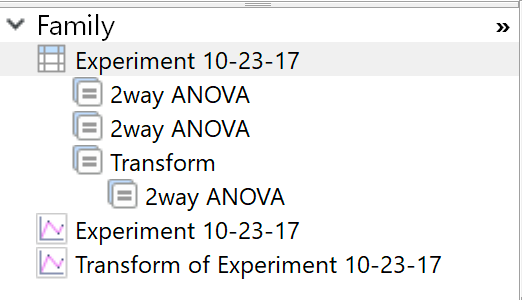
Moving from one sheet to a linked one is a key part of working with Prism, but sometimes was too hard. The family folder was useful but had to be repeatedly reopened.
With Prism 8, the bottom of the navigator now contains a panel showing the family of sheets related to the current sheet. It's always there. You don't have to specially open it as you did in prior versions of Prism. Click to go to a related sheets. Chains of analyses are automatically indented, so you no longer need to open the separate Data+Results folder.

However, we heard your feedback, and some of you prefer to have your Data and Results sheets organized together in the Navigator. In Prism 8.2, you can toggle between separate "Data" and "Results" sections and a combined "Data with Results" section by right-clicking in the Navigator (you can also set a default in Prism's preferences).
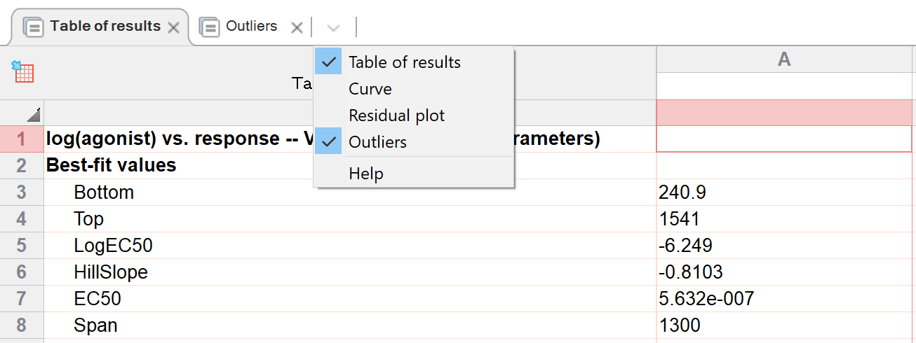
Easily jump between multiple results tables for one analysis (and hide the ones you don't want to see)
Many Prism analyses generate several tables of results. These were shown as subsheets, and all were listed -- even the ones only used to make graphs but are rarely actually looked out. Prism 8 shows the multiple results tables for an analysis as tabs across the top of the window. Results tables designed for graphing (XY coordinates of curves; residulas; QQ plots...) are hidden by default, but you can choose to view them.

Snapping that actually works
When you move one object on a graph or layout, Prism 7 tried to help by "snapping" the object you are moving into alignment with other objects on the page. However, this was sometimes more of a hindrance than a help. The problem was that Prism would sometimes try to snap to an object you are moving away from.
For Prism 8, we've totally revamped snapping so only tries to snap to objects that you are moving towards. This makes it much more helpful and way less intrusive. You can still turn it off if you want to, but you won't want to!
Snapping now also works when rotating an object, with snapping at 0, 90, 180 and 270 degree.
Simpler nonlinear regression dialog
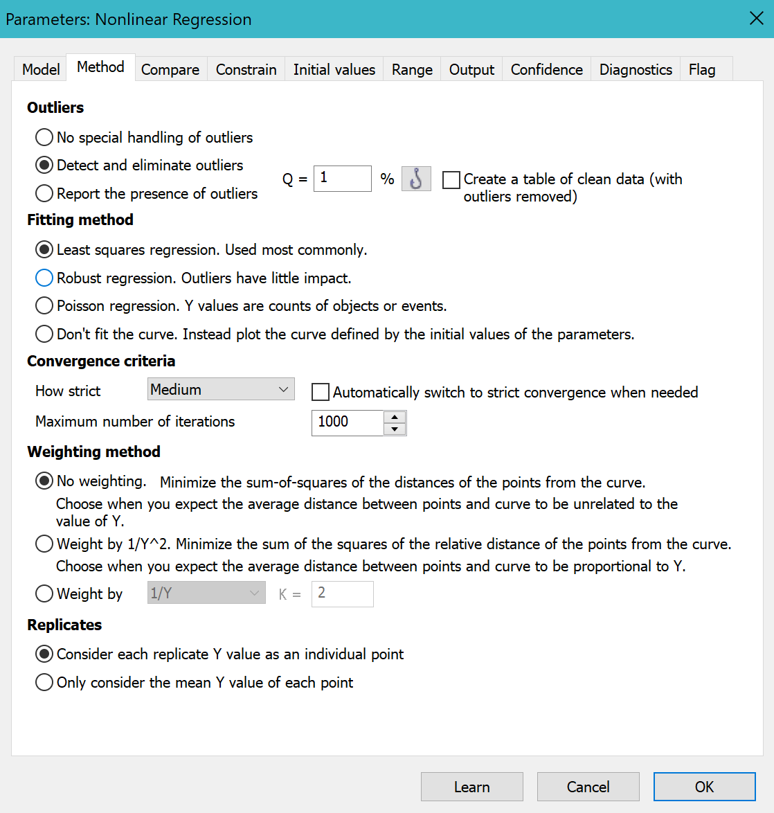
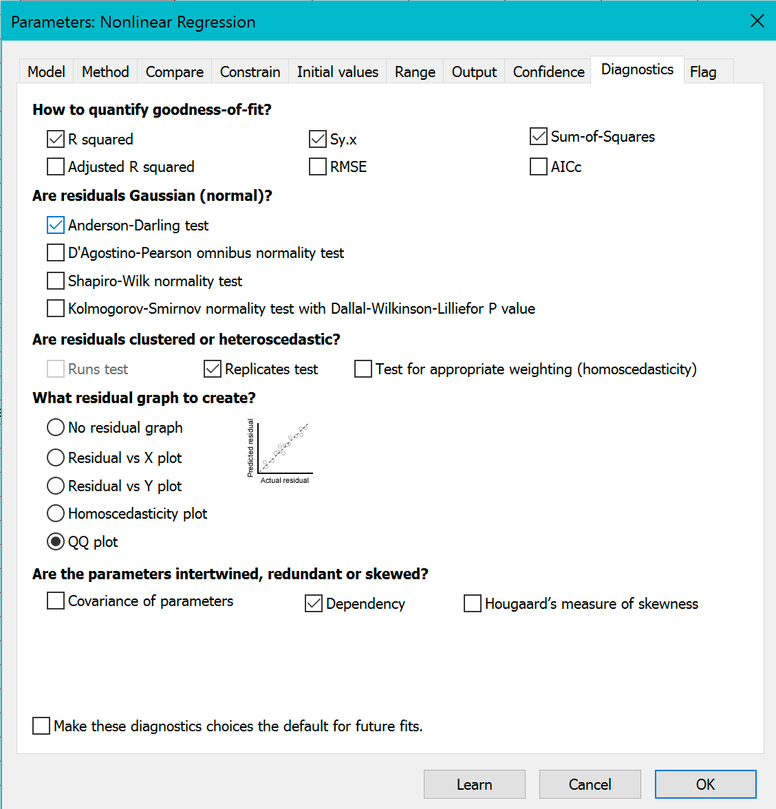
We reorganized the nonlinear regression dialog to make it easier to use.


•The first tab, now renamed to Model, is simpler as it no longer has choices about outliers or robust fitting.
•A new tab, Method, takes the place of the Weights tab which had only a few choices. The Method tab includes choices for weighting, and also includes these choices: Whether to perform least-squares, robust or Poisson regression, or to show the curve generated by the initial values; whether to count, exclude, or ignore outliers; and how to define convergence.
•The Diagnostics tab is less cluttered as some options were moved to the Method tab. Added to the Diagnostic tab is a choice of four kinds of residual graphs.
The complicated column statistics analysis has been split into three focused analyses
The column statistics analysis was complicated because it combined distinct analyses. Prism 8 makes things easier by offering three distinct analyses: Descriptive statistics, Normality (and lognormality) testing, and one-sample t test (and Wilcoxon) analyses.
Change size of graph more easily
The commands to enlarge a graph and reduce the graph size were not in synch in Prism 7. If you clicked twice to increase the graph size, then clicked twice to reduce graph size, you wouldn't end up where you started. The problem is that if you first increase size by 25% and then decrease by 25%, you don't end up where you started. You need to reduce by 20%. We fixed this for Prism 8.
Less intrusive warnings about graphs
Prism 7 often presented warnings on graph about data points that are off scale, error bars that can't be shown, etc. These tended to be wordy and were often annoying. Prism 8 shows much shorter messages, with a link to a longer explanation. And you can turn these off entirely with a new setting in Preferences.
Easier searching
Searching for sheets is easier, and you can now search for sheets with highlights or notes of a specified color.
