Subcolumn graphs
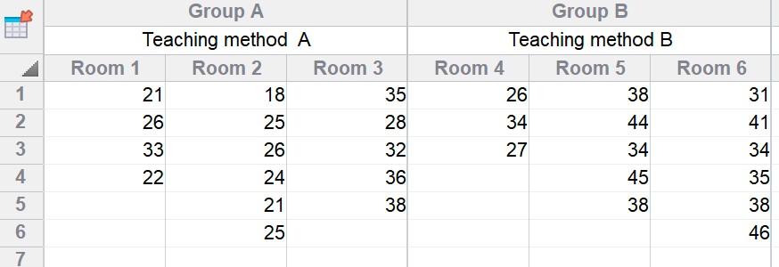
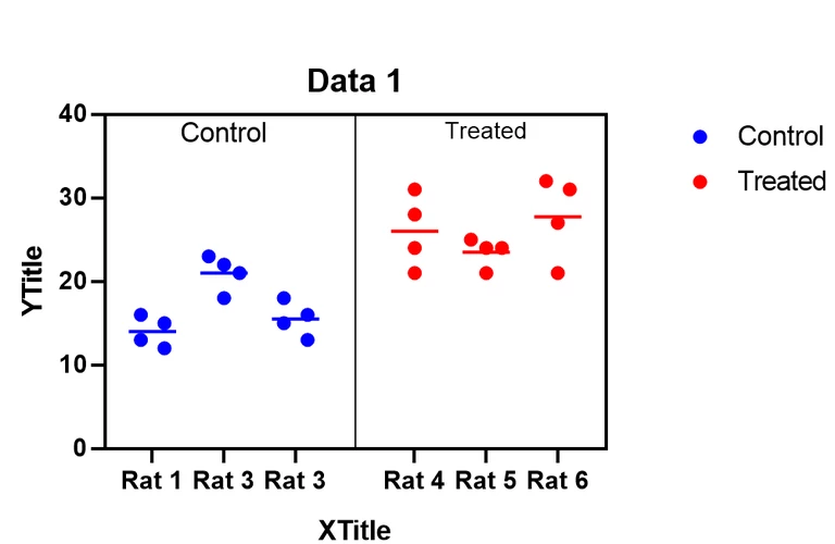
Prism 8 offers a new kind of data table for nested data where values stacked in each subcolumn are related, and creates subcolumn graphs of these data. In this example, there are two treatments given to three rats each and the outcome variable was measured four times in each rat. Each subcolumn can be plotted as a scatterplot (below), or mean or median with error as point or bar.
|
|
Violin plots
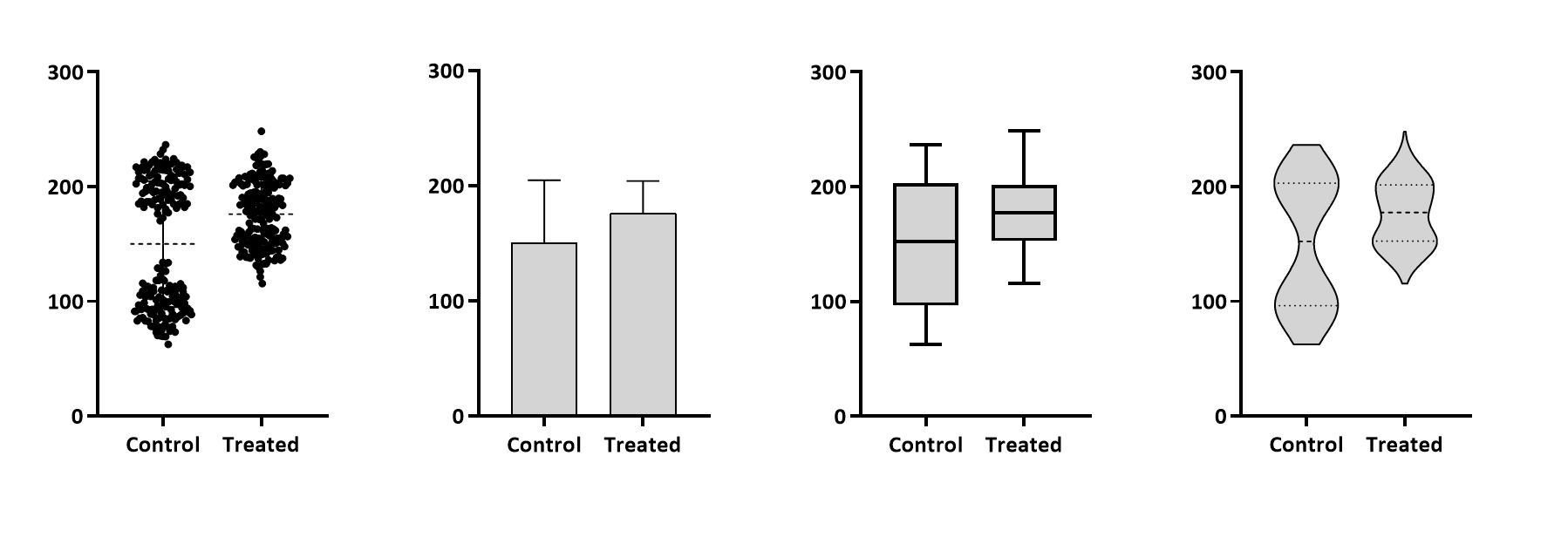
Violin plots show data distributions much more clearly than do box-whisker or bar graphs. Prism 8 can create violin plots (right graph below) of Column, Grouped or XY data.
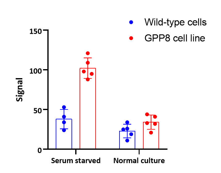
Grouped graphs that show both individual points (scatter) and bar with error bar.
You could make the graph below in Prism 7, but only if you knew a trick. With Prism 8, it is easy.
Smoothing and Akima splines
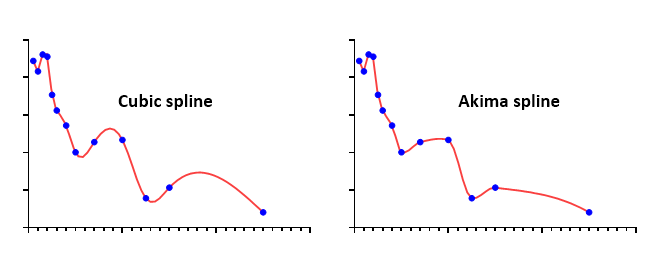
Prism has offered a spline analysis since version 1. These spline curves went through every point, so wiggled so much they were rarely useful. Prism 8 adds two more useful forms of splines (created using the Spline analysis).
•Smoothing splines. These track the general trend of the data without going through every point. You choose how many "knots" to use, which controls how many inflection points the curve has.

•Akima splines go through every point like cubic splines, but Akima splines make tighter turns so look better in many situations.
