Prism implements a unique method to identify outliers when fitting curves with nonlinear regression. This example shows you how easy it is to identify outliers with Prism. Learn more about how this method works, when it is useful, and when it should be avoided.
1. Create the data table
From the Welcome or New Table dialog, choose to create XY data table, choose to use tutorial data, and select the sample data "Eliminating outliers during nonlinear regression".

2. Inspect the data table and graph
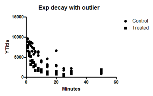
The data table has values for two data sets (control and treated) with triplicate subcolumns.
Since this is the first time you are viewing the graph, Prism will pop up the Change Graph Type dialog. Select the third choice, to plot individual replicates rather than mean and error bars.

3. Choose nonlinear regression
Click the Analyze button and choose Nonlinear regression from the list of XY analyses.
Alternatively, click the shortcut button for nonlinear regression.

4. Choose a model, and choose automatic outlier detection
On the Fit tab of the nonlinear regression dialog, open the panel of exponential equations and choose: One phase decay.

Then go to the Method tab and choose to identify and eliminate outliers. Learn about when outlier elimination is helpful, when it should be avoided, and how it works.

5. View the graph
Prism identified the outlier, and plotted it in red, overlaid on top of the data graph. After identifying the outlier, Prism fit the remaining data points as if the outlier wasn't present. Before accepting the results, think about why the point was an outlier. Remember, not all outliers are "bad" points.
Double click on the graph to bring up the Format Graph dialog. Go to the second tab. You can see that this graph now has three data sets, the data, the curve fit, and the outliers. Read more about graphing outliers.
