|
Visualizing scatter and testing for normality without a frequency distribution |
Scroll Prev Top Next More |
Viewing data distributions
Before creating a frequency distribution, think about whether you actually need to create one.
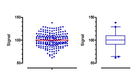
In many cases, plotting a column scatter graph is all you need to do to see the distribution of data. The graph on the left is a column scatter plot (with line drawn at the mean) made from the "Frequency distribution" sample data. The graph on the right is a box-and-whiskers graph of the same data, showing the values lower than the first percentile and greater than the 99th percentile as circles. Note that Prism offers several choices for how to define the whiskers in this kind of plot.
Both graphs were created by Prism directly from the data table, with no analysis needed.
Testing for normality
Prism can test for normality as part of the column statistics analysis. You don't have to create a frequency distribution, and then fit a Gaussian distribution.