1. Enter data
From the Welcome (or New Table and graph) dialog, choose the Column tab.
If you are not ready to enter your own data, choose sample data and choose: t test - unpaired.
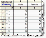
Enter the data for each group into a separate column. The two groups do not have to have the same number of values, and it's OK to leave some cells empty. Since the data are unmatched, it makes no sense to enter any row titles.

Note: The KS test works by comparing two cumulative frequency distributions. But you enter two stacks of data. Prism creates the frequency distributions as part of its analysis, but you can not enter frequency distributions and get Prism to compare them with the KS test.
2. Choose a test
1.From the data table, click  on the toolbar.
2.Choose t tests from the list of column analyses.
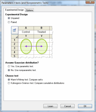
3.On the t test dialog, choose the an unpaired experimental design, and that you do not wish to assume a Gaussian distribution.

4.At the bottom of the first tab, choose either the Mann-Whitney (MW) or the Kolmogorov-Smirnov (KS) test. Here are some guidelines.
3. Choose options

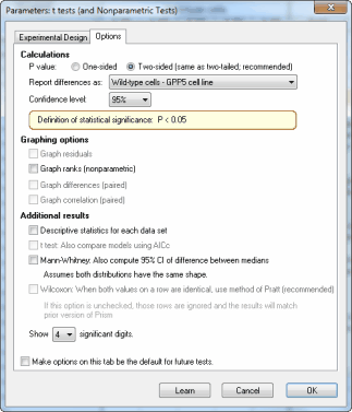
These options, with the exception of the option to tabulate descriptive statistics, only apply to the MW test and not the KS test.
•Choose a one- or two-tail P value. If in doubt, choose a two-tail P value.
•If you chose the option below to compute the 95% CI of the difference between medians, specify how Prism will compute that difference (A-B or B-A).
•The MW test works by comparing ranks. Check an option to graph those ranks.
•Create a table of descriptive statistics for each column.
•Compute the 95% confidence interval for the difference between medians. This calculation is only meaningful if you assume that the two population distributions have the same shape.
4. Review the results
Learn more about interpreting the results of a Mann-Whitney test.
Before accepting the results, review the analysis checklist.
5. Polish the graph
Graphing notes:
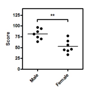
•A scatter plot shows every point. If you have more than several hundred points, a scatter plot can become messy, so it makes sense to plot a box-and-whiskers graph instead. We suggest avoiding bar graphs, as they show less information than a scatter plot, yet are no easier to comprehend.
• The horizontal lines mark the medians. Set this choice (medians rather than means) on the Welcome dialog, or change on the Format Graph dialog.
•To add the asterisks representing significance level copy from the results table and paste onto the graph. This creates a live link, so if you edit or replace the data, the number of asterisks may change (or change to 'ns'). Use the drawing tool to add the line below the asterisks, then right-click and set the arrow heads to "half tick down'.
