Curve fitting without a model
The term curve fitting is more general than regression. Your approach to curve fitting depends on your goal.
In some circumstances, you just want to draw a smooth curve to make a graph look attractive, or to use as a standard curve. You don't care about models, and aren't looking for best-fit values that you can interpret.
Prism provides two approaches for fitting a curve without selecting a model. From a table or graph of XY data, click Analyze, and then choose 'Fit spline/LOWESS" from the list of XY analyses.

Spline curves
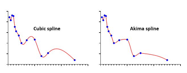
Up to Prism 7, Prism only offered cubic spline curves that go through every point. These tend to wiggle too much to be very useful. Prism 8 offers more kinds of splines.
In addition to the usual cubic spline that goes through every point, Prism now can also draw Akima splines. These also go through every point, but it makes tighter turns so some think it looks better.

Prism also can now plot smoothing splines. You decide the degree of smoothness by specifying the number of knots. This example shows splines with 3, 5, and 7 knots. Since the splines were derived for art (computer animation) the choice of how many knots to allow is yours to make artistically. Splines have nothing to do with data analysis.

Also check out fitting the hinge function. It connects two straight lines with a gentle curve.
Connect points with straight lines
Prism's spline/lowess analysis can also create a point-to-point "curve" -- a series of line segments connecting all your data. Don't create a point-to-point curve just so you can connect points with a line on the graph. You can do that by checking an option on the Format Graph dialog from the Graphs section of your project. Only select the point-to-point analysis if you want to use the point-to-point line as a standard curve, or if you wish to calculate area under that curve.
Note a subtle distinction between a point-to-point line "fit" by the spline analysis and a point-to-point line added in the Format Graph dialog. The two will look the same if both axes are linear. But if you use a logarithmic axis, the two are distinct. The lines created by Format Graph will look straight, even with the log axis. Prism simply connects the points. The point-to-point "curve" created by the spline analysis is actually a set of XY coordinates (you can decide how many). With a log axis, this point-to-point "curve" will not appear straight.
Lowess curves
A lowess curve follows the trend of the data and tends to be a bit jagged. Lowess curves can be helpful when the data progresses monotonically, but are less helpful when there are peaks or valleys. Prism lets you choose between coarse, medium and fine lowess curves. The coarse curve (left panel below) shows only the general trend, but obscures the detail. The fine curve (right panel below) reveals the fine structure of the data, but tends to wiggle a lot. The medium curve is in between.

Prism generates lowess curves using an algorithm adapted from reference 1. Details. Don't select a lowess curve unless you have well over twenty data points.
How many line segments
Prism generates the curve as a series of line segments. Enter the number of segments you want. The default is nearly always fine. Prism always generates a lowess curve with at least four times more line segments than the number of data points, and you cannot reduce the number of segments below this value.
Check the option box if you want Prism to create an output table with the XY coordinates of each point that defines the curve.
Standard curve calculations
Check the option if you want to use the resulting Lowess, point-to-point, or spline curve as a standard curve. How to enter data.