Fitting straight lines on graphs with nonlinear axes
The nonlinear regression analysis fits the data, not the graph. If you choose probability Y axis, graphs with data points that form a straight line follow nonlinear relationships. Prism's collection of "Lines" equations includes those that let you fit nonlinear models to graphs that appear linear when the Y axis is a probability axis. In these cases, linear regression will fit a straight line to the data but the graph will appear curved since an axis (or both axes) are not linear. In contrast, nonlinear regression to an appropriate nonlinear model will create a curve that appears straight on these axes.
Entering and fitting data
1.Create an XY table, and enter your X and Y values.
2.Go to the graph, double click on an axis to bring up the Format Axis dialog. Change the Y axis to a probability scale. 
3.Click Analyze, choose Nonlinear regression (not Linear regression) and then choose one of the Cumulative Gaussian distribution equations from the "Lines" section of equations.
Equations
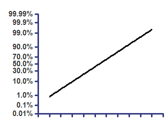
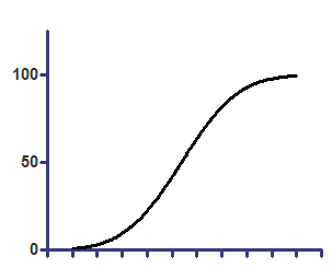
Cumulative Gaussian - Y values are percentages
Top=100
z=(X-Mean)/SD
Y=Top * zdist(z)
On probability axis |
On linear axis |
|
|
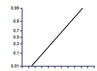
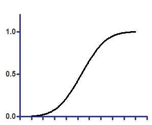
Cumulative Gaussian - Y values are fractions
Top=1
z=(X-Mean)/SD
Y=Top * zdist(z)
On semilog axis |
On linear axes |
|
|
Parameters
Mean is the average of the original distribution, from which the frequency distribution was created.
SD is the standard deviation of the original distribution.
Both of these parameters are expressed in the same units as the X values plotted on the graph, which is the same as the Y values in the original distribution from which the frequency distribution was generated.


