
Smoothing data can make it seem as though bad predictions (forecasts) are quite accurate
Matt Briggs has previously written about the dangers of smoothing here and here. The problem is simple: smoothing induces spurious correlations. His latest post points out that smoothing can make it appear that a prediction or forecast is far more accurate than it really is. I had a hard time following his argument, so I did my own simulations shown below. While the simulations and writing are mine, the ideas (except the last figure) all came from Briggs.
The problem
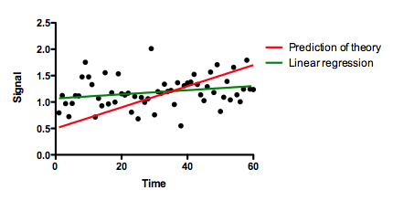
Below are some "data" (black dots actually randomly created) and a "prediction" (red line). The prediction was not computed from the data, but rather from some external theory. We want to quantify how well this prediction actually predicts. The graph shows that it doesn't predict well at all. There is a slight upward trend of the data points (green line, created by linear regression), but the theory (red line) predicts a much steeper rise. The linear regression is not impressive, with the 95% confidence interval of the slope including 0.0 (a horizontal line). The data are almost flat, while the theory predicts an increase over time.
How well does the theory predict the data?
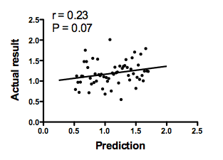
The graph below plots the prediction of the theory on the horizontal axis vs. the actual data on the Y axis. There is not much correlation. The Pearson correlation coefficient is only 0.23, so R2 is only 0.05. The conclusion is clear: The theory does a lousy job of predicting these data.
The analysis is done at this point. But let's try to push it further.
What happens if you smooth the data?
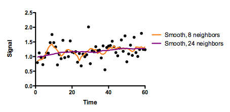
The graph below shows the data (black dots) and two smoothed curves. Both were created with GraphPad Prism, choosing a 2nd degree polynomial smoothing. The orange curve smoothed with the eight nearest neighbors, and the purple curve used 24 neighboring values, so is smoother. Briggs used a different smoother. It doesn't matter. The problems occur with all smoothing algorithms.
The smoothing accomplished its goal. The graph is smoother!
How well do the predictions of theory correlate with the smoothed data?
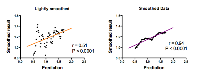
The black points are the smoothed data. Each point is one time point. But time is not on the graph. Instead, the horizontal axis plots the prediction of theory and the vertical axis plots the smoothed data at the corresponding time point. The left panel shows the effect of lightly (8 neighbors) smoothing, and the right panel shows the smoothing using 24 neighbors. The straight lines were fit by linear regression.
Now the correlation of the prediction with the data is convincing. The Pearson correlation coefficients (r) are high, and the P values (testing the null hypothesis that the true population correlation coefficient equals zero) are tiny.With more smoothing (right panel), the correlation coefficient is higher.
If you looked at these graphs (especially the one on the right), you might conclude that the theory does an awsome job of predicting the data. And you'd be wrong.
Computation of the correlation coefficient (and most other statistical calculations) assume that each data point contributes independent information. Smoothing destroys the validity of that assumption. The whole point of smoothing is to create smoothed values that combine the data from neighboring points so the resulting smoothed data points are not independent. Accordingly, any statistical calculations on the smoothed data (including correlation and linear regression) are meaningless.
What is the best way to assess accuracy of a prediction?
When I first wrote this page, I stopped here. Then I realized that there is another big problem. This graphs above answer the question:
How well do the predictions of theory correlate with the smoothed data?
That is not the right question! The critical question is:
How far are the predictions of theory from the smoothed (or original) data?
The left panel below shows the same graph as the prior one. But instead of plotting a linear regression line, this graph plots a 45 degree line. If the prediction were accurate, you'd expect all points to be on this line. This graph shows how poorly the theory predicts. Computing correlation coefficients above was just misleading.
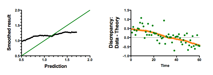
The right panel above makes the same point a different way. It shows the discrepancy (data - prediction) at each time point. The green dots show the discrepancy between prediction and the data. The orange dots (so close together they almost look like a line) show the discrepancy between the prediction and the highly smoothed data. This graph, which answers the question at hand, shows that the theory does a horrible job of predicting the data. For the first half of the series, the predictions are too low (so the discrepancy is positive). For the second half of the series, the predictions are too high (so the discrepancy is negative). It doesn't matter that the predictions correlated with the smoothed data -- they do an awful job of predicting.
Summary
This example makes two points.
The main point is that while smoothing may be marginally useful as a way to visualize data, the results of smoothing should never be used as inputs to statistical analyses (except specialized methods that account for smoothing). When smoothed data are anlayzed as if they were actual data, the results are meaningless and misleading.
The second point is demonstrated by a mistake I made. I first wrote this page without the last figure. I let statistical analysis get in the way of clear thinking about the question I was actually trying to answer, and stopped with the correlation analyses.
Download the Prism file of all these simulations and graphs.