
Prism 3 -- Lineweaver-Burk plots
Step-by-Step Examples:
Analyzing Enzyme Activity with Prism 3
Michaelis-Menten and Lineweaver-Burk Plots
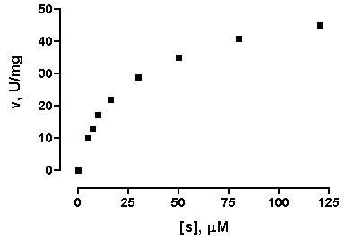
In this example, we'll make a combination graph commonly used to characterize enzyme activity-a curve of initial velocity vs. substrate concentration, sometimes referred to as a Michaelis-Menten plot, with an inset Lineweaver-Burk plot.
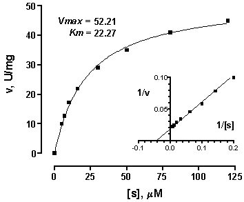
Lineweaver-Burk analysis is one method of linearizing substrate-velocity data so as to determine the kinetic constants Km and Vmax. One creates a secondary, reciprocal plot: 1/velocity vs. 1/[substrate]. When catalytic activity follows Michaelis-Menten kinetics over the range of substrate concentrations tested, the Lineweaver-Burk plot is a straight line with
Y intercept = 1/Vmax,
X intercept = -1/Km
slope = Km/Vmax
Now that programs such as Prism easily do nonlinear regression, the best way to determine Km and Vmax is to fit a hyperbola directly to the substrate-velocity data. Yet the Lineweaver-Burk plot continues to be a useful visual tool, particularly because of its characteristic shifts in the presence of various types of inhibitors. So we'll create a Lineweaver-Burk plot with data points derived from double-reciprocal transformation, but we'll superimpose a line based upon nonlinear regression analysis, so that it reflects the best possible estimates of Kd and Bmax.
| A different secondary plot, such as Hanes-Woolf or Eadie-Scatchard, is just as easy to create with Prism. Simply modify the data transformation discussed below. In fact, for Eadie-Scatchard, you may prefer to follow this example, while making appropriate changes to axis titles and labels. |
Enter the Enzyme Activity Data
When you launch Prism, the Welcome to Prism dialog appears. Choose to Create a new project and to Work independently. Uncheck the option box at the bottom of the Welcome dialog to Pop up new user hints.
In the lower half of the Welcome dialog, tell Prism how to format the first data table. For the X column, select Numbers (XY Graph). For the Y columns, choose the format that fits your data; to keep data entry in this example short, we'll use A single column of values.
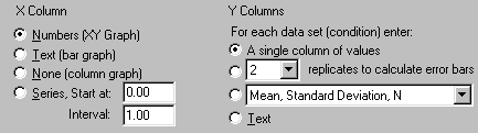
When you click OK, Prism displays the new table.
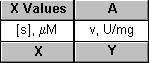
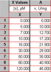
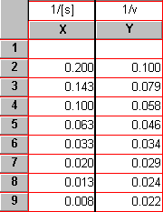
For each point on the substrate-velocity curve, enter the concentration of substrate into the X column and the value for initial velocity into the Y column. The units are up to you—use whatever is meaningful. Just remember that Prism will graph the data and compute the binding parameters in whatever units you've used on your table. Place labels over the X and Y columns as a reminder:
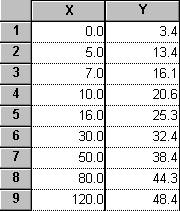
Here are the data for our example:
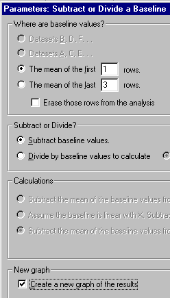
Suppose that this data is uncorrected for a constant background value of 3.4, which you determined from your assay measurement in the absence of substrate (row 1). You can use Prism to make the background correction (subtract 3.4 from each Y value). Click Analyze, then choose Remove baseline from the Data manipulations menu. In the Parameters: Subtract or Divide a Baseline dialog, tell Prism where the baseline is (in this example, the mean of the first 1 rows; note that you also have the option to put "baseline" values in the bottom row(s) and that, when appropriate, you may exclude those rows from the analysis). Choose to Subtract baseline values and to Create a new graph of the results.
The corrected data are produced on a Results sheet labeled "...Remove baseline":
| In this example, we did a baseline correction by subtracting the Y value in the first row from all the other Y values. Prism gives you other options—you can subtract a constant value specified in a parameters dialog rather than on the data table, or you can subtract a different number on each row. See our Quick Answers Database for the details. |
Since we requested it as part of the "Remove baseline" analysis, Prism makes a new graph of the corrected data. To view the new graph, choose the last (most recently created) graph listed in the "Graphs" section of the Explorer.
|
To offset the X and Y axes as shown above, double-click on one of the axes, then choose Offset X & Y axes from the Frame & Axes drop-down menu.
The graphs in this step-by-step example include some other formatting changes not covered here—to learn more, consult the Prism User's Guide. |
Fit a Curve to the Substrate-Velocity Data to Compute Km and Vmax
You can quickly fit a curve to the data using the One-site binding (hyperbola) model from the "Classic equation" menu, but then the kinetic constants will be reported as "BMAX" and "KD". Instead, we'll import an equation from a template included with Prism.
With the baseline-corrected Michaelis-Menten plot (the last graph listed in the "Graphs" section of the Explorer) in view, click the Analyze button. Choose the Curves & Regression category, and select Nonlinear regression (curve fit). Click OK.
In the Parameters: Nonlinear regression dialog box, choose More equations. From the window below, select [Import an equation from a Prism file or template]. The Equation Import dialog appears. Select Michaelis-Menten from the file Enzyme kinetics template (Note: If you don't see these choices, click the "Browse..." button, then select "Enzyme kinetics template.PZT" from the "Sample templates" directory). Click OK twice to exit the parameters set-up and complete the curve fit. The curve should appear on the graph.
| A fitted curve is treated by Prism as a separate data set (different from the underlying points). In this instance, we started the curve-fit analysis from the graph, so Prism knows where we want the curve to go. At other times, that may not be the case. When you do a curve fit and get a corresponding Results sheet, but can find no curve on your graph, click Change.. Data on Graph. The resulting dialog shows which data sets are included on the graph. Click Add to open the Add Data Sets to Graph dialog, from which you can select the appropriate curve and add it to the graph. |
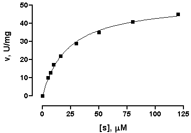
Click the yellow Results tab, or choose the sheet Results-[n]:Nonlinear regression (curve fit). Prism displays the best-fit values for the kinetic constants.
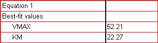
If your results don't agree with those shown here, check to be sure that you did the curve fit starting from the baseline-corrected Michaelis-Menten graph.
The units for Vmax are the units that you used when entering Y values on the original data table. The units for Km are the units you used when entering the X values.
Display Kinetic Constants on the Graph
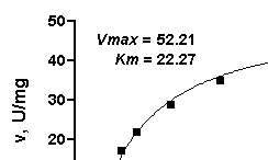
If you wish, you can paste cells from this results table to your graph, so that the kinetic constants will be displayed there and will also be linked to the results sheet. That way, if you change the saturation binding data later, Vmax and Km will be automatically updated both on the results sheet and on the graph. If you don't like the way the pasted data are displayed, you can change that. Suppose that you wish to paste the data, but make your own labels and customize the display. Select a cell on the results sheet containing the value you want to paste. Choose Edit.. Copy. Switch to the graph, and choose Edit.. Paste Table. The value is placed on the graph, and you can drag it wherever you want. Now use the text tool (bottom row of the toolbar)...

...to add customized labels. Click on the text tool button, then click on the graph approximately where you want the label, and type your label. You can make the label boldface, or resize it, or add subscripting as desired, using the text editing tools.
Click elsewhere to exit the text insertion mode, then select the label so that you can drag it into position (use the arrow keys on your keyboard to make the final adjustments). Here is a finished example:
At this point, you may wish to change some of your original activity data (data table) and observe how the values of Vmax and Km change automatically on the results sheet and on the graph.
Prepare the Lineweaver-Burk Transforms
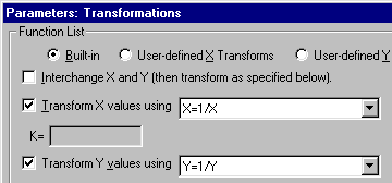
From the Results sheet containing the baseline-corrected substrate-velocity data, click Analyze and then choose to Analyze the results table you are looking at. Click OK to open the Analyze Data dialog, then select Type: Data manipulations and Transforms. In the next dialog, Parameters: Transformations, choose to transform both X and Y, replacing them with 1/X and 1/Y, respectively. At the bottom of the dialog, check the box to Create a new graph of the results. Here are the settings for the transforms:
The transformed data are shown on a new results sheet (the original data are unchanged in the "Data tables" section of your project). Prism will carry over the original column titles, which will now be incorrect, so you can edit them if you wish:
| Notice that the top row of the results table is blank. Prism leaves individual cells blank when it has been asked to perform an illegal math operation, in this case to evaluate the quantity 1/0, in that cell. |
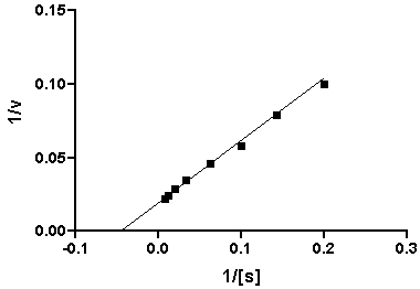
Complete the Lineweaver-Burk Plot
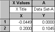
The default Lineweaver-Burk plot appears as the most recently generated graph (now the last graph listed in the Explorer). You will notice that there is no line superimposed over the points. We recommend that you add a line to your graph that accurately reflects the Kd and Bmax values that we found using nonlinear regression. This will be a straight line running from the X intercept to the point predicted by the nonlinear regression analysis for the lowest non-zero substrate concentration (i.e., the highest value of 1/[s]). Referring to the results sheet for your nonlinear regression analysis and the original substrate-velocity data table, note that the coordinates for the X-axis intercept are
X = -1/Km = -1/22.27 = -0.0449
Y = 0
and the coordinates for the upper-right end of the line are
X = 1/[Smin] = 0.2
Y = (1/Vmax)(1+Km/[Smin]) = (1/52.21)(1+22.27/5) = 0.1045
Switch to the table section of your project, choose New Table, and format the table for X = Numbers (XY Graph) and Y = A single column of values. Check the box labeled Don't make an automatic graph of these data. Fill in the table using the coordinates above:
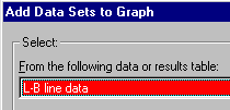
Note the name of this data table. You may wish to rename it to something more meaningful, such as "L-B line data". Now switch back to the Lineweaver-Burk plot (the graph we created in the previous section). Choose Change.. Data on Graph and add the new data table to the graph (click Add..., then select the correct data set from the list in the next dialog box).
Click Add again, then Close to return to the previous dialog, then OK to complete the process.
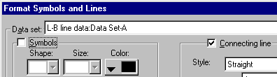
This results in the Y and X intercepts being plotted as points. Format this data set to make the points invisible but to connect them with a line: Press Change.. Symbols and Lines. On the list of data sets, select the one you noted above (e.g., L-B line data). Choose to plot no symbols, but to connect them with a line.
Here is the graph, with axis titles edited:
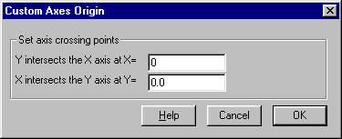
It will look more conventional if we move Y axis to the right. Double-click on the X axis to open the Axes dialog. Choose Custom from the Origin submenu, and click the Custom Origin... button. Now set the Y axis to intersect the X axis at X = 0.
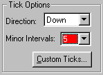
It might also enhance readability to add some minor ticks. When you exit the Custom Axes Origin dialog, you will return to the Axes dialog. Alternately select X Axis or Y Axis at the top of this dialog box (Axis:). Then for each axis, choose to have 5 minor tick intervals:
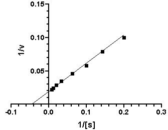
Here is the finished plot:
Create a Composite Graph (Layout)
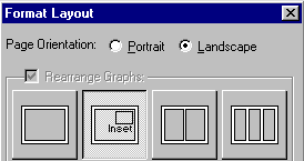
Switch to the Layout section of your project, and click New Layout. Choose the Landscape orientation and the Inset arrangement:
When you click OK, you'll see a layout with two placeholders. Double-click on each in turn, assigning your saturation binding plot to the larger placeholder, and your Lineweaver-Burk plot to the smaller placeholder. Now you can then individually select, then move and resize, each graph so that the two fit together nicely. Hint: choose the larger graph (v vs. [s]) first and make it as large as you can.
Note that as you resize the Lineweaver-Burk plot, Prism does a certain amount of reproportioning of the graph-adjusting font sizes and line thicknesses—as appropriate. But you will probably want to make some modifications of your own to further improve its readability. Here are some suggestions, which have been applied in our final illustration below.
|
To make the modifications below, switch to the appropriate graph sheets—don't try to make them on the layout. After you make each change, switch back to the layout and check the result there. |
|
|
|
|
To make this modification: |
Do this: |
|
|
|
|
Lengthen the Y axis of the larger graph to make more room for the inset graph |
Click once to select the Y axis, then drag the top "handle" upward |
|
|
|
|
Reduce the range of each axis on the inset graph |
Double-click on the axis, deselect the "Auto" setting under Range and Tick Interval, and enter a new Maximum value |
|
|
|
|
Enlarge the tick labels (numbers) on the inset graph |
Select an axis, then click the "+" text formatting button on the bottom row of the toolbar. |
|
|
|
|
Thicken the axes |
Click on an axis, then choose Format.. Object |
|
|
|
|
Enlarge the symbols |
Double-click on a symbol, then reset Size |
|
|
|
|
Simplify and move the axis titles |
Select and delete the automatically placed titles, then use the text tool to generate new labels. Format and move to more convenient locations |
|
|
|
Copyright (c) 2001, GraphPad Software Inc. All rights reserved.