New to Prism 7, Heat maps are a standard way to plot grouped data. The basic idea of a heat map is that the graph is divided into rectangles or squares, each representing one cell on the data table, one row and one data set. The rectangle or square is color coded according to the value of that cell in the table. Prism offers lots of options to make Heat maps useful.
Enter data on a Grouped table. Most often you'll want to format this with no subcolumns. In this case, each number you enter maps to one rectangle on the heat map. Unless you choose to reverse or transpose axes, the arrangement of the colors on the heat map will correspond to the numbers in the table. If your table as three rows and four columns, the heat map will also have three rows and four columns.
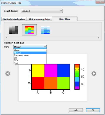
If you enter replicate values in side by side subcolumns, you can later choose if you want the heat map to be based on the mean, median or geometric mean of the replicates. You can even choose to make a heat make of variation, and use the SD, %CV or SEM as the basis of the heatmap.
When you go to the automatic graph (or choose New..Graph of existing data), the New Graph dialog opens. Choose the Heat Map tab and make basic choices about the kind of heat map you wish to make.
Once you see the graph, double click on it to bring up the Format Graph dialog with many more choices.